Showing posts with label Nick and Norah. Show all posts
Friday, June 17, 2011
TGIF: And I Quote
For this sort of disgusting, humid, rainy Friday in New York, Ginger over at GReads! has asked:
What are some of your favorite book quotes?
Oh, boy. Do I like book quotes. I'm the crazy girl who is constantly trying to find a scrap of paper or typing furiously on her iPhone whilst reading because I love writing down and keeping quotes that I find from books. But that makes this particular question a little hard because I have SO MANY.
So I will limit myself and only choose four. :)
"They danced down the streets like dingledodies, and I shambled after as I've been doing all my life after people who interest me, because the only people for me are the mad ones, the ones who are mad to live, mad to talk, mad to be saved, desirous of everything at the same time, the ones that never yawn or say a commonplace thing, but burn, burn, burn... —Jack Kerouac, On the Road
I'm a little obsessed with the Beat generation writers—in fact I wrote my undergraduate thesis on them—and this particular quote gives me chill-bumps every single time I read it. Obsessed. But not as much as these people.
"Run mad as often as you choose but do not faint."—Jane Austen, Mansfield Park
So, apparently I really like the word "mad." Who knew?! But of Austen's works, I really, really love Mansfield Park. I love Fanny Price and her wit, and I love the political ramifications of the novel, and I just love it. And I love this quote.
"If I don't shut down my brain soon, my imagination will take off so far about what could be with this guy, that nothing will ever just be."—Rachel Cohn & David Levithan, Nick & Norah's Infinite Playlist
Holy cow THIS QUOTE. I'm such a planner, but I also have the tendency to get ahead of myself, especially when it comes to relationships. When I read this quote y'all, it was like a freaking siren went off in my room. I felt like it was directed at me, and just so resonated with me. And now, every time I meet a guy, I think of this quote so that I don't let my imagination get ahead of reality.
"One must always be careful of books," said Tessa, "and what is inside them, for words have the power to change us."—Cassandra Clare, Clockwork Angel
Hooray bookish quotes! :)
Alright, so them's my quotes. Since I am a quote collector of sorts, feel free to share your faves with me in comments!
I hope y'all have all had a fantastic week and are looking forward to a bright, shiny weekend full of FUN!
Friday, April 22, 2011
TGIF: Gettin' Down & Dirty
I don't know if y'all feel this way, but this has been a crazy long week over in Bethie-land. Work has been stressful, my roommate's family (including a toddler) is in town and staying with us, and I keep forgetting to bring my book to work so I can read on my lunch break.
However. It is Friday, glorious Friday. And since this particular Friday is Good Friday, I have my fingers crossed that the office will close at 3:00 and I can go home and veg a couple hours earlier than normal.
Anyway. This question of the week from Ginger at GReads! iiiiiis:
However. It is Friday, glorious Friday. And since this particular Friday is Good Friday, I have my fingers crossed that the office will close at 3:00 and I can go home and veg a couple hours earlier than normal.
Anyway. This question of the week from Ginger at GReads! iiiiiis:
Explicit Material: How do you feel about explicit language &/or sexual content in YA books?
My answer is super simple: I love it.
I don't find anything offensive or wrong with cussing or a sex scene. Let's be honest, it's not like teens aren't cussing and developing/exploring their sexuality. They are. It's all part of growing up, and I feel like being crass and a tidbit promiscuous it's a vital part of being a teenager. Call me a heathen if you must, but I actually think a YA novel WITHOUT a couple cuss words and a smutty scene is strange, and more often than not, unsatisfying.
That being said, I don't want to pick up a YA novel and be accosted by F-bombs and raunchy, overwrought bedroom scenes--if I want that, I'll go to the romance section. Or I'll just re-read everything by Candace Bushnell.
If you are interested in some YA novels that involve cussing and sexy times, but aren't raunchy, I will point you in the direction of:
Nick and Norah's Infinite Playlist by Rachel Cohn & David Levithan
If I Stay and Where She Went by Gayle Forman
The Curse Workers series by Holly Black
Looking for Alaska by John Green
I'm such a cheerleader for these books, I know. BUT THEY ARE GOOD.
I hope everyone has a great Friday, and a fabulous weekend! Happy Easter!
Tuesday, April 5, 2011
Top 10 Tuesday: Book Covers I Wish I Could Redesign
Top Ten Tuesday is a weekly meme hosted by the lovely, lovely ladies over at The Broke and The Bookish. The topic du semaine this time around is book covers we wish we could redesign.
Oh boy. I'm about to hate on a bunch of books that I like (or will probs like) a whole, whole, whole bunch.
But before I begin, I would like to say this: I am not a graphic designer. I can barely do more than crop a picture in Photoshop. I have the UTMOST respect for cover and jacket designers, because their jobs are HARD. I can't imagine doing it because there are just so many dadgum people to please and an entire audience to attract and...that's just a lot to deal with. Anyway. I just wanted to say that before I viciously attack some covers.
But now that it has been said, the claws are officially coming out, WOLVERINE-STYLE.
1. White Cat by Holly Black
First up is White Cat, a book whose words I adore, but whose cover I think looks so damn cheesy. I'm pretty sure it's the red cover smoke's fault...although I like that it covers his eyes. And I want to fix the dude's hair. Hmm. Maybe if it was just the cat I'd like it more? [But then that would be misleading because people would be all "KITTY!!!!!!" and then give the book to their 7-year-old niece and then all hell would break loose.] I don't know what I would do with this. Maybe if it was just the cat's face and it was staring out at you unblinkingly so that it's a bit creepy. Sure, that would work. (Right?)
2. The Name of the Star by Maureen Johnson
I love Maureen Johnson. LOVE HER. And I am SUPER PUMPED about her upcoming mystery/thriller The Name of the Star. But when she joyously revealed the cover, I was SO DISAPPOINTED. I don't necessarily know why I'm disappointed, but I am. I think I'd be happier with it if the guy was not shadowy, and was, like, standing over her or ominously chillin' in the background. But I wouldn't want to see his face. But, then again, I only have the vaguest idea what this book is about, so maybe once I read it this cover will make more sense. But then...doesn't that kind of make the point of the fact that there is a cover image moot? Le sigh.
3. City of Fallen Angels by Cassandra Clare
I know, I know I'm officially a social pariah. This cover made a humungo splash and everyone was oh-so happy with it . . . but I think it's weird. The colors aren't attractive, and it's a strange deviation from the other books in the series because of the presence of two people on the cover and the fact that you can see Clary's face. I realize that I'm in the minority here, and that's alright. If I could redesign it, I think I'd just have Simon on the cover. Yeah. SIMON. *crosses arms over chest, gangsta-style*
4. Angelfire by Courtney Alison Moulton
First of all, the chick on the cover looks like a girl I know IRL whom I dislike greatly. Second of all, there is weird cover smoke. I apparently hate cover smoke. (except for on Looking for Alaska. That cover smoke is INSPIRED.) Other than that, I like it. If I were going to redesign it, I'd probably just have her with the awesome weapon-thingamajigger and a black background. The pink in the title and her lovely red hair would really pop then. And she would look all foreboding and badass. :)
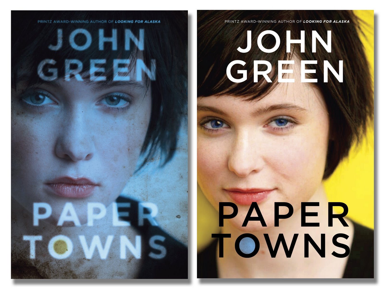
5. Paper Towns (Hardcover version) by John Green
I ALL KINDS OF DISLIKE THESE COVERS. Yes, the plot of the book is driven by the disappearance of a girl, but. I don't know. These just turn me off. The only reason I read the book is out of my devotion to one John Green (heyyyy there) and I'm glad I read it because it is AWESOME, but if I knew nothing of Mr. Green, I would have never, ever, ever picked this up. That being said, I ALL KINDS OF DIG the paperback cover.
6. Stupid, rotten, no good Twilight one-off covers
*shakes with rage*
7. The Disreputable History of Frankie Landau-Banks (paperback) by E. Lockhart
When compared to the hardcover version of this book (right), the paperback design looks sophomoric. The hardcover design is subtle, cheeky even, while the paperback looks cheap, dumb, and like every other book about a girl in a boarding school ever written. Except this particular girl apparently doesn't own a brush. I love this stinkin' book so stinkin' much that I don't want people to pass it by due to the horrid, horrid paperback cover and their inability to see beyond the cover. Why couldn't they just use the hardcover art as the paperback art?! *BETHIE ANGRY* *begins to turn green*
8. Nick & Norah's Infinite Playlist by Rachel Cohn & David Levithan
I really, really wish that the bottom half with the blurry faces that make it seem like dude man is sucking on girl's cheek would go bye bye. If the text was centered, and the background was just black or gray or some such color I'd probably like it more. Although it would need some sort of brighter accent color, huh? For, you know, color accenting purposes. Maybe have something music-related on the front? Or if it were an ipod and the screen had the text on it?! Oh God, that's bad. People, that, RIGHT THERE, is why I edit text and do not design images.
9. I Am Number Four by [mothereffing] Pittacus Lore
This cover is dumb. Just put Alex Pettyfer on the front and be done with it. (I think they did do that with the movie tie in cover? I didn't pay enough to attention to find this out. Nor do I care enough to Google.) I don't know why they didn't do that in the first place--it's not like they didn't know he was cast when it was being published since mothereffing James Frey sold it as both a screenplay and as a book at the same time, and then when the screenwriters made edits, he made edits to the manuscript like that was just fiiiine for him to do. *begins to turn green again*
10. My head hurts from thinking about James Frey. So, I'm going to quit and go to my happy place (currently: with Anna and St. Clair in Paris.)
Oh boy. I'm about to hate on a bunch of books that I like (or will probs like) a whole, whole, whole bunch.
But before I begin, I would like to say this: I am not a graphic designer. I can barely do more than crop a picture in Photoshop. I have the UTMOST respect for cover and jacket designers, because their jobs are HARD. I can't imagine doing it because there are just so many dadgum people to please and an entire audience to attract and...that's just a lot to deal with. Anyway. I just wanted to say that before I viciously attack some covers.
But now that it has been said, the claws are officially coming out, WOLVERINE-STYLE.
1. White Cat by Holly Black
First up is White Cat, a book whose words I adore, but whose cover I think looks so damn cheesy. I'm pretty sure it's the red cover smoke's fault...although I like that it covers his eyes. And I want to fix the dude's hair. Hmm. Maybe if it was just the cat I'd like it more? [But then that would be misleading because people would be all "KITTY!!!!!!" and then give the book to their 7-year-old niece and then all hell would break loose.] I don't know what I would do with this. Maybe if it was just the cat's face and it was staring out at you unblinkingly so that it's a bit creepy. Sure, that would work. (Right?)
2. The Name of the Star by Maureen Johnson
I love Maureen Johnson. LOVE HER. And I am SUPER PUMPED about her upcoming mystery/thriller The Name of the Star. But when she joyously revealed the cover, I was SO DISAPPOINTED. I don't necessarily know why I'm disappointed, but I am. I think I'd be happier with it if the guy was not shadowy, and was, like, standing over her or ominously chillin' in the background. But I wouldn't want to see his face. But, then again, I only have the vaguest idea what this book is about, so maybe once I read it this cover will make more sense. But then...doesn't that kind of make the point of the fact that there is a cover image moot? Le sigh.
3. City of Fallen Angels by Cassandra Clare
I know, I know I'm officially a social pariah. This cover made a humungo splash and everyone was oh-so happy with it . . . but I think it's weird. The colors aren't attractive, and it's a strange deviation from the other books in the series because of the presence of two people on the cover and the fact that you can see Clary's face. I realize that I'm in the minority here, and that's alright. If I could redesign it, I think I'd just have Simon on the cover. Yeah. SIMON. *crosses arms over chest, gangsta-style*
4. Angelfire by Courtney Alison Moulton
First of all, the chick on the cover looks like a girl I know IRL whom I dislike greatly. Second of all, there is weird cover smoke. I apparently hate cover smoke. (except for on Looking for Alaska. That cover smoke is INSPIRED.) Other than that, I like it. If I were going to redesign it, I'd probably just have her with the awesome weapon-thingamajigger and a black background. The pink in the title and her lovely red hair would really pop then. And she would look all foreboding and badass. :)
5. Paper Towns (Hardcover version) by John Green
I ALL KINDS OF DISLIKE THESE COVERS. Yes, the plot of the book is driven by the disappearance of a girl, but. I don't know. These just turn me off. The only reason I read the book is out of my devotion to one John Green (heyyyy there) and I'm glad I read it because it is AWESOME, but if I knew nothing of Mr. Green, I would have never, ever, ever picked this up. That being said, I ALL KINDS OF DIG the paperback cover.
6. Stupid, rotten, no good Twilight one-off covers
*shakes with rage*
7. The Disreputable History of Frankie Landau-Banks (paperback) by E. Lockhart
When compared to the hardcover version of this book (right), the paperback design looks sophomoric. The hardcover design is subtle, cheeky even, while the paperback looks cheap, dumb, and like every other book about a girl in a boarding school ever written. Except this particular girl apparently doesn't own a brush. I love this stinkin' book so stinkin' much that I don't want people to pass it by due to the horrid, horrid paperback cover and their inability to see beyond the cover. Why couldn't they just use the hardcover art as the paperback art?! *BETHIE ANGRY* *begins to turn green*
8. Nick & Norah's Infinite Playlist by Rachel Cohn & David Levithan
I really, really wish that the bottom half with the blurry faces that make it seem like dude man is sucking on girl's cheek would go bye bye. If the text was centered, and the background was just black or gray or some such color I'd probably like it more. Although it would need some sort of brighter accent color, huh? For, you know, color accenting purposes. Maybe have something music-related on the front? Or if it were an ipod and the screen had the text on it?! Oh God, that's bad. People, that, RIGHT THERE, is why I edit text and do not design images.
9. I Am Number Four by [mothereffing] Pittacus Lore
This cover is dumb. Just put Alex Pettyfer on the front and be done with it. (I think they did do that with the movie tie in cover? I didn't pay enough to attention to find this out. Nor do I care enough to Google.) I don't know why they didn't do that in the first place--it's not like they didn't know he was cast when it was being published since mothereffing James Frey sold it as both a screenplay and as a book at the same time, and then when the screenwriters made edits, he made edits to the manuscript like that was just fiiiine for him to do. *begins to turn green again*
10. My head hurts from thinking about James Frey. So, I'm going to quit and go to my happy place (currently: with Anna and St. Clair in Paris.)
Subscribe to:
Posts (Atom)