Top Ten Tuesday is a weekly meme hosted by the lovely, lovely ladies over at
The Broke and The Bookish. The topic
du semaine this time around is book covers we wish we could redesign.
Oh boy. I'm about to hate on a bunch of books that I like (or will probs like) a whole, whole, whole bunch.
But before I begin, I would like to say this: I am not a graphic designer. I can barely do more than crop a picture in Photoshop. I have the UTMOST respect for cover and jacket designers, because their jobs are HARD. I can't imagine doing it because there are just so many dadgum people to please and an entire audience to attract and...that's just a lot to deal with. Anyway. I just wanted to say that before I viciously attack some covers.
But now that it has been said, the claws are officially coming out, WOLVERINE-STYLE.
1.
White Cat by Holly Black
First up is
White Cat, a book whose words I adore, but whose cover I think looks so damn cheesy. I'm pretty sure it's the red cover smoke's fault...although I like that it covers his eyes. And I want to fix the dude's hair. Hmm. Maybe if it was just the cat I'd like it more? [But then that would be misleading because people would be all "KITTY!!!!!!" and then give the book to their 7-year-old niece and then all hell would break loose.] I don't know what I would do with this. Maybe if it was just the cat's face and it was staring out at you unblinkingly so that it's a bit creepy. Sure, that would work. (Right?)
2.
The Name of the Star by Maureen Johnson
I love Maureen Johnson. LOVE HER. And I am SUPER PUMPED about her upcoming mystery/thriller
The Name of the Star. But when she joyously revealed the cover, I was SO DISAPPOINTED. I don't necessarily know
why I'm disappointed, but I am. I think I'd be happier with it if the guy was not shadowy, and was, like, standing over her or ominously chillin' in the background. But I wouldn't want to see his face. But, then again, I only have the vaguest idea what this book is about, so maybe once I read it this cover will make more sense. But then...doesn't that kind of make the point of the fact that there is a cover image moot?
Le sigh.
3.
City of Fallen Angels by Cassandra Clare
I know, I know I'm officially a social pariah. This cover made a humungo splash and everyone was oh-so happy with it . . . but I think it's weird. The colors aren't attractive, and it's a strange deviation from the other books in the series because of the presence of two people on the cover and the fact that you can see Clary's face. I realize that I'm in the minority here, and that's alright. If I could redesign it, I think I'd just have Simon on the cover. Yeah. SIMON. *crosses arms over chest, gangsta-style*
4.
Angelfire by Courtney Alison Moulton
First of all, the chick on the cover looks like a girl I know IRL whom I dislike greatly. Second of all, there is weird cover smoke. I apparently hate cover smoke. (except for on
Looking for Alaska. That cover smoke is INSPIRED.) Other than that, I like it. If I were going to redesign it, I'd probably just have her with the awesome weapon-thingamajigger and a black background. The pink in the title and her lovely red hair would really pop then. And she would look all foreboding and badass. :)
5.
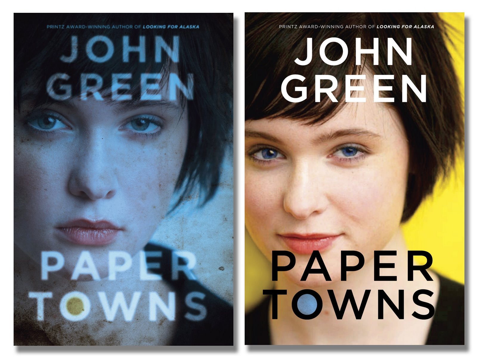
Paper Towns (Hardcover version) by John Green
I ALL KINDS OF DISLIKE THESE COVERS. Yes, the plot of the book is driven by the disappearance of a girl, but. I don't know. These just turn me off. The only reason I read the book is out of my devotion to one John Green (heyyyy there) and I'm glad I read it because it is AWESOME, but if I knew nothing of Mr. Green, I would have never, ever, ever picked this up. That being said, I ALL KINDS OF DIG the
paperback cover.
6.
Stupid, rotten, no good Twilight one-off covers
*shakes with rage*
7.
The Disreputable History of Frankie Landau-Banks (paperback) by E. Lockhart
When compared to the hardcover version of this book (right), the paperback design looks sophomoric. The hardcover design is subtle, cheeky even, while the paperback looks cheap, dumb, and like every other book about a girl in a boarding school ever written. Except this particular girl apparently doesn't own a brush. I love this stinkin' book so stinkin' much that I don't want people to pass it by due to the horrid, horrid paperback cover and their inability to see beyond the cover. Why couldn't they just use the hardcover art as the paperback art?! *BETHIE ANGRY* *begins to turn green*
8.
Nick & Norah's Infinite Playlist by Rachel Cohn & David Levithan
I really, really wish that the bottom half with the blurry faces that make it seem like dude man is sucking on girl's cheek would go bye bye. If the text was centered, and the background was just black or gray or some such color I'd probably like it more. Although it would need some sort of brighter accent color, huh? For, you know, color accenting purposes. Maybe have something music-related on the front? Or if it were an ipod and the screen had the text on it?! Oh God, that's bad. People, that, RIGHT THERE, is why I edit text and do not design images.
9.
I Am Number Four by [mothereffing] Pittacus Lore
This cover is dumb. Just put Alex Pettyfer on the front and be done with it. (I think they did do that with the movie tie in cover? I didn't pay enough to attention to find this out. Nor do I care enough to Google.) I don't know why they didn't do that in the first place--it's not like they didn't know he was cast when it was being published since mothereffing James Frey sold it as both a screenplay and as a book at the same time, and then when the screenwriters made edits, he made edits to the manuscript like that was just fiiiine for him to do. *begins to turn green again*
10. My head hurts from thinking about James Frey. So, I'm going to quit and go to my happy place (currently:
with Anna and St. Clair in Paris.)


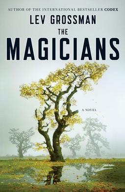
 Another group of books I've never really written about on this blog are books that aren't considered YA. For example, I recently read Kathryn Stockett's The Help and Lev Grossman's The Magicians. While I probably wouldn't have reviewed The Help, as I'm glad I read it but don't necessarily have much to say about it, and I actually do have thoughts on The Magicians . . . but I'm not sure if it necessarily fits in with the tone and audience of this particular blog? But, then again. It's MY blog. So maybe you'll see a review of The Magicians on here in the next week or so. Who knows!