This is my first week doing TGIF, a meme hosted by Ginger over at GReads!, and the question she posed is this:
What are your favorite book covers?
This is quite the question, non? No matter what people say about the publishing industry and the downward spiral of print books and blah blah blah, there is nothing quite as exciting as walking into a bookstore (or library or friend's place or passing a stranger reading in a park) and spotting a cover that immediately grabs your attentions and forces you to walk toward it. I'm pretty sure I've felt that way toward more books than I have men. Just sayin'.
But, there are lots of pretty covers. Too many for a single blog post! So, for me, a cover that is memorable is one that requires thought, and, in a weird way, one that requires that I have an emotional connection with it. And I'm not talking an emotional connection with the words that are housed inside the cover--I'm talking the cover itself. It needs to resonate with me on its very own. [All of a sudden I feel like I'm taking this too seriously. Oh well, no looking back now!]
Anyway, enough of my rambling, let's get started, shall we?
My first pick is a cover I'm sure is going to be a popular choice for this TGIF. It's the iconic, haunting cover for The Great Gatsby created by Frances Cugat. It took me a looooong time to understand how perfectly complex, and perfectly ironic, this cover is. It's genius. In fact, I like the cover more than I like the book!
Alright, it's no secret that I have a slight obsession with John Green. But my obsession with him, and my obsession with the cover for Looking for Alaska, designed by Linda McCarthy, are two entirely different beasts. When I first picked this book up, I vaguely knew of the fantastic Mr. Green, and had zero idea what this book was about. But that didn't matter. All I wanted to know was why the candle had gone out. Did someone blow it out? Did it go out on its own? How long had it been burning? I HAD TO KNOW. And now that I know, this is one of those covers that gives me chills. LOVE. IT.
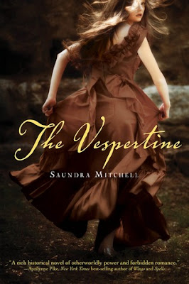
The next (and last! If I didn't stop myself at three, I'd still be writing this blog post.) is a very recent cover, but one that I just can't stop thinking about--the cover for Saundra Mitchell's The Vespertine, designed by Regina Roff. I seriously find myself thinking about it while I'm at work. Or watching TV. Just all of a sudden, in my mind, there it is being all gorgeous and mysterious. Like the Looking for Alaska cover, this one has a story all its own--who is this girl?, where is she going?, at whom is she looking or?--or wait--from whom is she running? It's just amazing.
Alright, them's be my picks! Let me know what your favorite covers are, and allll about your weekend plans, in comments! TGIF!!


I almost considered picking The Great Gatsby too! That book was the first novel I read in high school that I actually WANTED to read & not because I had to. It holds a special place in my heart for sure. I think the cover speaks volumes. Awesome picks! & I love your explanations on each one :-)
ReplyDeleteThank you for joining TGIF this week! & happy reading, as always :-)
Looking for Alaska definitely has a good cover! I love the trail of smoke against the black background.
ReplyDeleteI want to read looking for alaska! I've heard John Green books are amazing, but I haven't gotten around to him yet. Great blog, btw! I'm your newest follower. :)
ReplyDeleteAhhh, yes, that Great Gatsby cover is a classic! (Even though the eyes fah-reak me out)
ReplyDelete